Key Takeaways
- The core job of a dashboard is time to insight: how quickly you can go from looking at it to knowing what question to ask next.
- Every dashboard should start with a North Star metric shown period-over-period and on a long-term trend line, so stakeholders can distinguish normal fluctuations from real problems.
- The best dashboards anticipate the questions stakeholders will ask, not just display data. That’s the difference between a reporting dashboard and an insight dashboard.
- Always ground your dashboard in source-of-truth revenue (from Shopify, HubSpot, or your CRM), not platform-reported numbers.
Why Most Marketing Dashboards Go Unused
The problem with most marketing dashboards isn’t the data. It’s information overload.
Default dashboard templates, whether from Looker Studio, Tableau, or any other visualization platform, tend to function as technology demos. They showcase every chart type the tool can render. Bar charts, pie charts, geographic heat maps, funnel visualizations, all crammed into a single view. It looks impressive in a screenshot. It’s useless in practice.
At Flywheel Digital, we define the core job of a marketing dashboard as time to insight. How quickly, from the moment you open it, can you say: “I see what’s happening. I know what to dig into next. I have answers to the questions I came here with.”
Most dashboards fail this test because they force the viewer to do too much cognitive work. You have to scan a dozen charts, figure out which ones are relevant to the question you actually have, mentally compare time periods, and then try to draw conclusions. By the time you’ve processed all of that, you’ve already lost five minutes and you’re not sure what you learned.
The best marketing dashboards are ruthlessly focused. They show less data, not more. And counterintuitively, that makes them significantly more useful. There’s nothing like a good combination bar and line chart to communicate performance at a glance.
Reporting vs. Insight: Two Different Jobs
Before building a dashboard, it helps to understand that dashboards serve two distinct purposes, and conflating them is one of the most common design mistakes.
Reporting Dashboards
A reporting dashboard answers the question: “What are the numbers?” It shows KPIs, tracks whether metrics are going up or down, and provides a place to check the current state of affairs. It’s not trying to explain anything. It’s just a data display.
Reporting dashboards are important. You need a place to quickly verify where things stand. Sometimes the best reporting dashboard is as simple as a CRM table showing deals closed over time. You look at the deals flowing through, and you have your answer. No charts needed.
Insight Dashboards
An insight dashboard goes further. It doesn’t just show what happened. It anticipates the questions you’ll have about why it happened and surfaces the relevant data to answer them.
The key difference is anticipation. A reporting dashboard reacts to whatever the viewer wants to know. An insight dashboard proactively addresses the most likely follow-up questions before anyone has to ask.
For example, if your North Star metric is monthly revenue from advertising, the most common follow-up questions are usually: “Is the change driven by lead volume or conversion rate?” and “Which channel is responsible?”
An insight dashboard puts those answers right below the top-level number. Revenue is up 15% this month. Below that: leads from ads are up 22%, but lead-to-deal conversion is down slightly. You’ve answered the “why” before anyone has to ask.
The only way to build this kind of dashboard is to start by asking your stakeholders: “What questions do you want to answer when you open this?” That plain-English intake shapes everything that follows.
North Star Metrics
Every marketing performance dashboard should open with one number: the North Star metric.
For most businesses, this is revenue. For some, it’s qualified leads. For others, it’s enrolled students or booked demos. Whatever your organization has agreed is the single most important indicator of marketing success, that goes at the top of every view.
The North Star metric needs to be displayed in two ways simultaneously, and this is where most dashboards fail.
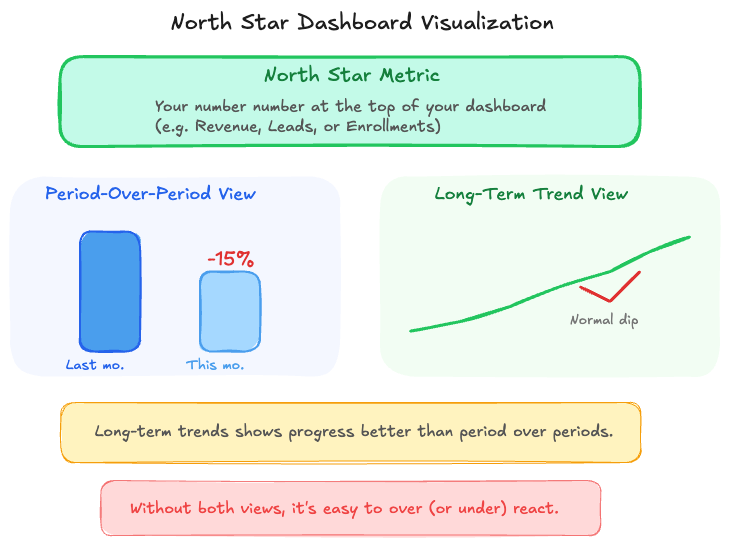
Period-Over-Period Comparison
Show the current period compared to the previous period. This week vs. last week. This month vs. last month. This gives you the immediate signal: are things better or worse than they just were?
Long-Term Trend Line
Alongside the period-over-period view, show the same metric on a longer time horizon. At minimum the last 90 days, ideally the last six to twelve months.
This combination is critical because period-over-period data alone creates a panic cycle. If your dashboard only shows week-over-week results, a 20% drop looks alarming. But a 20% drop after six consecutive weeks of growth puts you right back at your baseline. That’s a perfectly normal fluctuation.
Without the long-term trend line, stakeholders react to noise as if it’s signal. With it, they can sanity-check: “Are we 20% down for the fourth week in a row? That’s a real problem. Or are we 20% down after a record month? That’s normal regression to the mean.” This combination of views prevents the panic-and-pivot cycle that derails so many marketing strategies.
What to Include (and What to Leave Out)
After the North Star metric, every additional chart or data view should earn its place by answering a specific anticipated question. This is where the reporting vs. insight distinction becomes very practical.
Include: Data That Explains the North Star
If your North Star is revenue, the charts below it should help explain why revenue moved. That typically means lead volume by channel, conversion rates at key funnel stages, and cost per acquisition trends. Every chart should connect back to the top-level number.
Include: Comparisons That Drive Decisions
If you run campaigns across Meta, Google, and email, showing the relative performance of each channel helps you decide where to shift budget. But only if the comparison uses consistent data definitions, which is where a tool like Funnel becomes essential (more on that below).
Leave Out: Interesting-but-Not-Actionable Data
This is where most dashboards go wrong. They include data that’s mildly interesting but doesn’t help anyone make a decision.
The classic example is a city-level conversion report. It shows you which cities your conversions come from. For most national brands, this chart is pure noise. Spoiler: most of your conversions come from California and New York. That’s true for virtually every national advertiser, and knowing it doesn’t change any decisions you’ll make this quarter.
If you’re a franchise-based business where each location has different performance characteristics, city-level data is genuinely useful. For everyone else, it’s taking up space that could be occupied by something that actually drives a decision.
Before adding any chart to a dashboard, ask: “If this number changed significantly, would we do anything differently?” If the answer is no, leave it out.
The Source of Truth Problem (and How to Solve It)
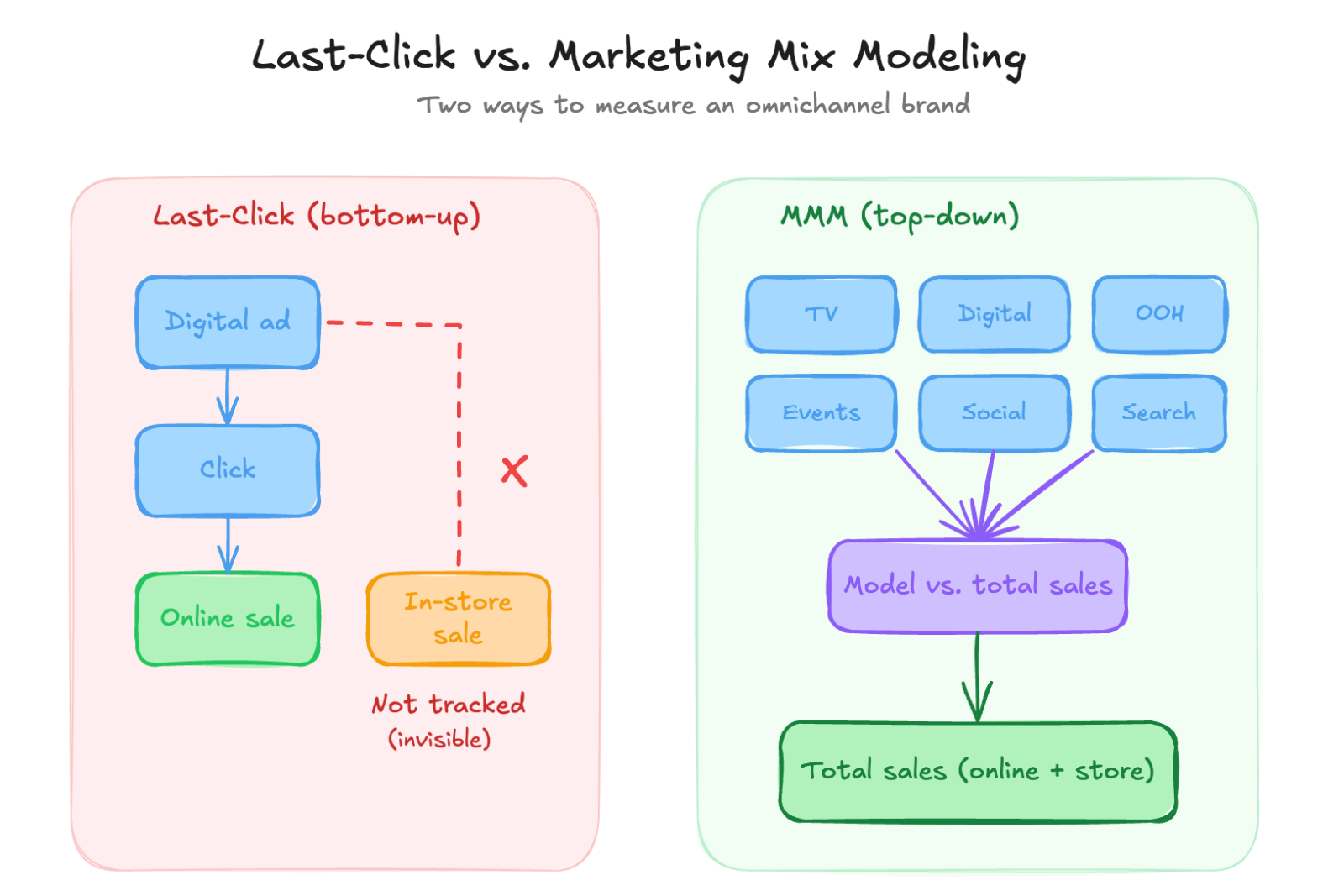
Here’s a scenario that plays out at nearly every company with a multi-channel marketing program: Meta says you made $200K in revenue last month. Google Ads says $150K. Shopify says $180K. None of these numbers agree, and the sum of Meta and Google’s reported revenue already exceeds what Shopify shows.
This happens because every platform takes credit for overlapping conversions. A customer who saw a Meta ad and clicked a Google ad gets counted by both platforms. Without a system to reconcile these views, your marketing analytics dashboard is built on conflicting data, and stakeholders lose trust in it fast.
The fix is architectural. Your dashboard needs to be grounded in source-of-truth revenue, meaning the revenue number from whatever system actually processes your transactions. That’s Shopify for e-commerce, HubSpot or Salesforce for B2B, or your accounting system for services businesses.
At Flywheel, we use Funnel as our marketing data platform to solve this. Funnel ingests data from the source of truth (Shopify, HubSpot, whatever it is) alongside data from every ad platform, email tool, and analytics system. It normalizes the definitions across sources, so “purchase” means the same thing regardless of which platform reported it.
The result is a dashboard where source-of-truth revenue sits at the top, and platform-specific metrics sit alongside it for comparison. You can see your total Shopify revenue and your Meta-reported revenue on the same screen. The discrepancy becomes visible and useful rather than hidden and confusing.
When we started orienting our e-commerce clients’ dashboards around Shopify revenue instead of platform-reported revenue, something interesting happened: clients started paying significantly more attention to the reports. When the number at the top matches what they see in their bank account, the dashboard feels real. When it’s a hypothetical number from an ad platform, it feels academic.
Designing for Hidden Stakeholders
When we design a dashboard, we always ask: who else is going to see this, beyond the person requesting it?
The obvious users are the marketing team and the agency (Flywheel). But there are almost always hidden stakeholders. The marketing director wants to include a snapshot in their presentation to the CEO. The CEO wants to bring numbers to a board meeting. The sales team wants to see how marketing-sourced leads are converting.
Each of these audiences has different needs. A weekly internal dashboard might show day-by-day trends. A board-ready view needs quarterly aggregates with year-over-year comparisons. A sales-marketing alignment dashboard focuses on lead quality and handoff metrics.
The discovery process for this is straightforward: ask how the dashboard will be shared, with whom, and on what cadence. If reporting goes to a board quarterly, the dashboard needs a quarterly view with period-over-period and year-over-year comparisons built in. If the CEO sees a weekly Slack update, the dashboard needs a summary view that fits in a screenshot.
Designing for these downstream uses from the beginning is much easier than retrofitting later. And it prevents the common failure mode where stakeholders build their own separate spreadsheets because the dashboard doesn’t serve their specific view, fracturing the source of truth all over again.
The Flywheel Dashboard Design Process
When we build a marketing analytics dashboard for a client, here’s the process we follow.
Step 1: Plain English Intake. We ask the client to tell us, in normal language, what they want to know. No jargon, no chart specifications. Just: “What questions do you have about your marketing performance?” and “What segments or breakdowns do you pay attention to?”
Step 2: Define the North Star. We agree on the single most important metric. This becomes the anchor for everything that follows.
Step 3: Map the Question Tree. Based on the intake, we map the most likely follow-up questions stakeholders will have when the North Star moves. These questions become the second tier of the dashboard.
Step 4: Connect Source of Truth. Using Funnel, we ingest revenue data from the actual transaction system and normalize it against platform data. This ensures the dashboard is grounded in real numbers.
Step 5: Build for All Stakeholders. We design views for the primary user, the executive summary user, and any other audiences identified in discovery.
Step 6: Reduce Until It Hurts. Before launch, we do a final pass and ask, for every chart and data point: “If this changed, would anyone act differently?” If not, it gets cut. This step is uncomfortable but essential. It’s what separates a dashboard that gets used from one that gets bookmarked and forgotten.
The result is a dashboard that loads fast, communicates clearly, and most importantly gets opened week after week instead of being forgotten after the first month.
If you need a marketing dashboard that drives real decisions, explore how Flywheel builds analytics systems for growth brands.
Frequently Asked Questions
What tool should I use for marketing dashboards?
The tool matters less than the design. Looker Studio, Tableau, and Power BI all work well. The critical factor is whether the tool can connect to your source-of-truth data (Shopify, HubSpot, etc.) directly or via a data pipeline tool like Funnel. A beautifully designed dashboard built on unreliable data sources is worse than a plain spreadsheet built on the right data.
How often should I update my marketing dashboard?
Most marketing dashboards should refresh daily. The viewing cadence, however, depends on the audience. Marketing teams might check daily or weekly. Executives typically review weekly or biweekly. Board reporting is quarterly. Design the dashboard to support all these cadences with appropriate time-range controls.
What’s the most common dashboard mistake?
Including data that’s interesting but not actionable. Every chart should answer the question: “If this number changed significantly, would we do anything differently?” If the answer is no, remove it. The second most common mistake is using platform-reported revenue instead of source-of-truth revenue, which erodes stakeholder trust in the entire system.
How do I make my dashboard “board-ready”?
Board reporting needs quarterly aggregates, year-over-year comparisons, and a clear connection between marketing spend and revenue outcomes. Strip out channel-level tactical details and focus on total revenue, total marketing investment, the ratio between them (AMER), and the trend over time. A board wants to know if marketing is working as a system, not which Meta ad set is performing best.
What should a marketing dashboard include?
At minimum, every marketing dashboard should include your North Star metric (usually revenue) with both a period-over-period comparison and a long-term trend line, your marketing spend by channel, cost per acquisition or cost per lead, and the ratio of revenue to total marketing investment (AMER). Beyond those essentials, add only charts that answer specific questions your team regularly asks. Less is almost always more.
If your current reporting fails to distinguish normal fluctuations from real revenue problems, the Flywheel marketing analytics team builds dashboards that prioritize time to insight. They embed senior strategists and AI agents to ensure your data leads directly to growth decisions rather than just more questions.